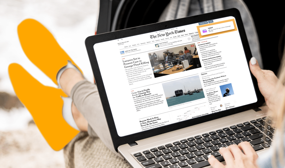
We have already explained how push notifications look like in different operating systems and browsers. You can also change titles, descriptions, and visuals in your notifications.
How to increase the CTR of a push and the campaign conversion if creativity is limited by the visual?
To choose a color of push notification that is guaranteed to increase sales.
The first rule: pick an appropriate color
Pick a color that matches the offer.
For example, if you blast for sweepstakes, it will be logical to make the creo as bright as possible to prompt the user to have a feeling of joy and victory.

If the product is elite and expensive, the creative may even be black.
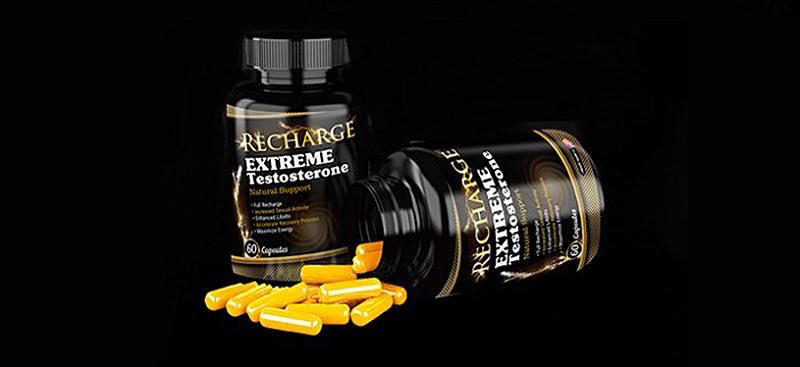
The color of the push notifications evokes the user’s emotions, therefore, the CTR is directly dependent on the color design of the creative.
- 85% of users consider the color of the advertisement or product packaging to be a determining factor when buying.
- 67% of users do not make a purchase if they do not like the color of the advertisement.
Second rule: change the user’s mood
Use the color to change the mood of your audience.
Each of the six primary colors has its own information message:
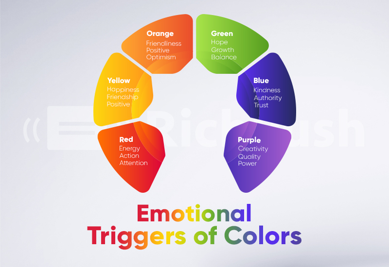
- Purple, blue, and green decrease the number of impulsive actions.
- Yellow, orange, and red increase this number.
The third rule: pick a color based on the type of the offer
Red
It symbolizes danger, warning, urgency, and at the same time strength, love, passion.
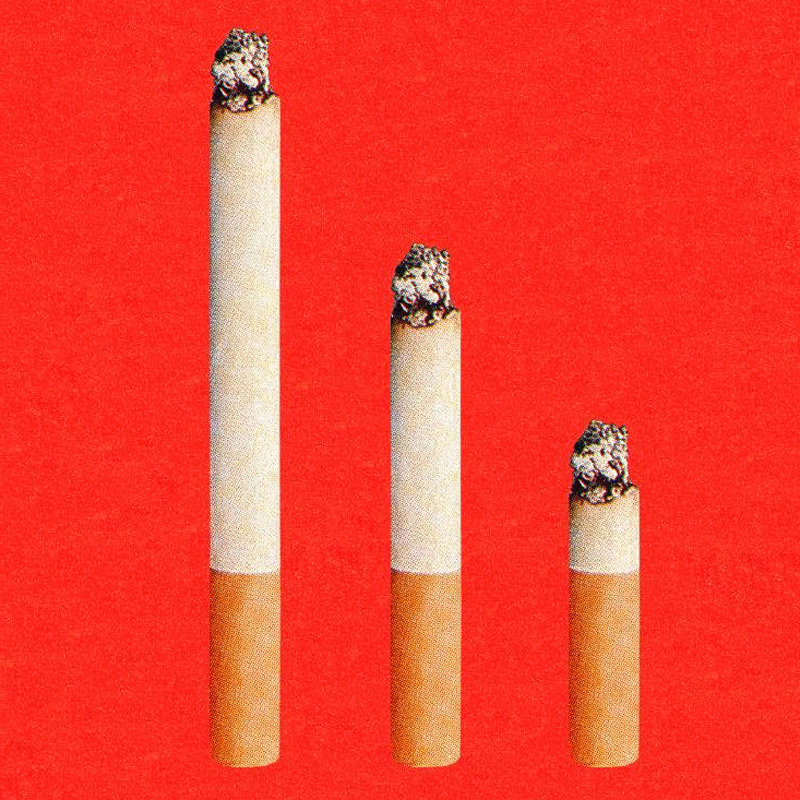
It’s effective in gambling, product ads. The color triggers spontaneous purchases, so buttons and calls to action are often highlighted in red.
An example of a visual for an anti-smoking solution:
Blue
The blue color symbolizes calmness, stability, confidence. That’s why blue pushes get more clicks and increase sales.
Creos that are predominantly blue are suitable for financial, nutra, and credit offers.

Green
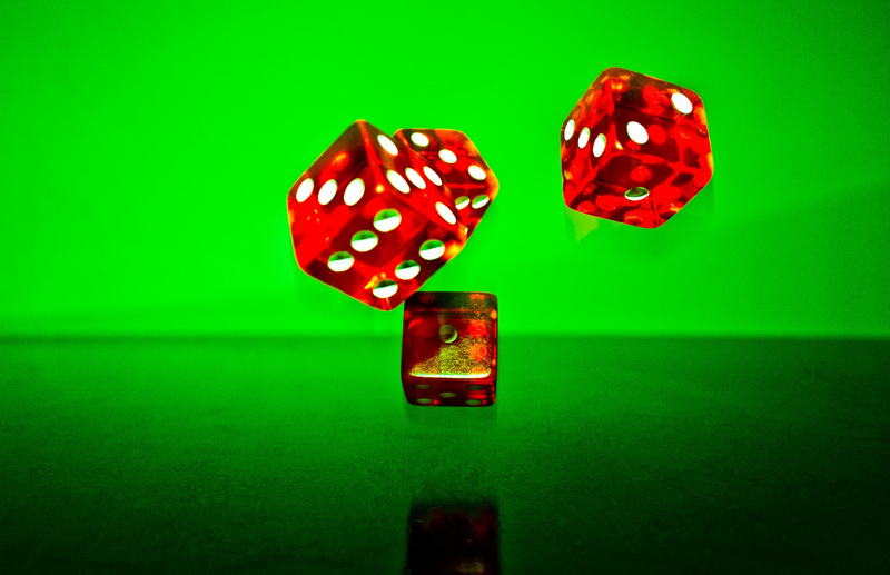
It’s the color of harmony and tranquility, environmental friendliness, and freshness.
Green calls for purchase. As a traffic light signal, it allows the user to follow the lead.
The color actively stimulates action, that’s why it is suitable for virtually all offers.
Purple
The color symbolizes wealth, well-being, and, depending on the shade, luxury.
Which offers to use purple visuals for? For offers that target women.
According to statistics:
- 77% of women like the purple color and another 11% are neutral to it;
- only 28% of men like purple, the color doesn’t trigger any emotions with the other men.
Orange
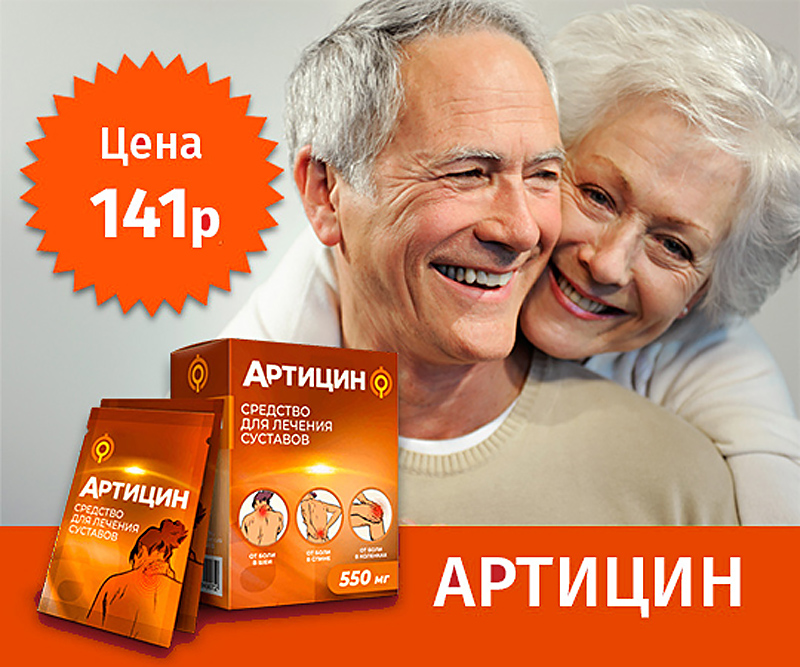
The color does not convey a sense of urgency, but it is ideal for the design of buttons for the target action. Orange elements look positive and welcoming, inviting the user to subscribe to the newsletter, register, or order the product. Orange looks bright and creates contrast against any background color.
The visual helps the user get in the mindset of positivity and friendliness, emphasizes youth and constant movement. Therefore, choose orange shades to offer games, potency, and any anti-aging treatments.
Yellow
The yellow color triggers a desire for creativity, a feeling of warmth, and happiness.
Yellow is the color of the sun and joy, but at the same time, it can cause a feeling of fear and frustration.
Use yellow visuals to offer games, products, sweepstakes, slimming solutions. Choose a warm, “sunny” shade.

Using certain colors for different offers has a strong effect on conversions. Some shades convey a sense of urgency, others reduce anxiety and tenseness. Some colors convey a sense of calmness, others inspire and call to action.
Sometimes changing the color of the visual to the exact opposite one multiplies conversions. Test different pushes in RichAds, play with your users’ emotions and get conversions.
What is RichAds?
🔝 Push and pop ads,
🔼 CPC starts from $ 0.003,
🔝 CPM from $0,3 in Tier 3, $0,5 in Tier 2, $1 in Tier 1,
⏫ large volumes of available traffic in more than 200 geos.


