RichAds shares three key tips on creatives: how not only to influence the user with an attractive offer but also to launch a subconscious interaction with the ad.
First method: the location of the text and graphics
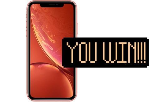
If the visual contains text, place the image on the left and the image on the right.
When the graphics are placed on the left side of the creative, the speed of information processing increases: the user perceives the notification faster and develops a positive opinion.
Examples of creos:

Second method: a desire to interact with the product
If the creative depicts something with which the user may interact, place it in such a way that will trigger a desire to pick it up.
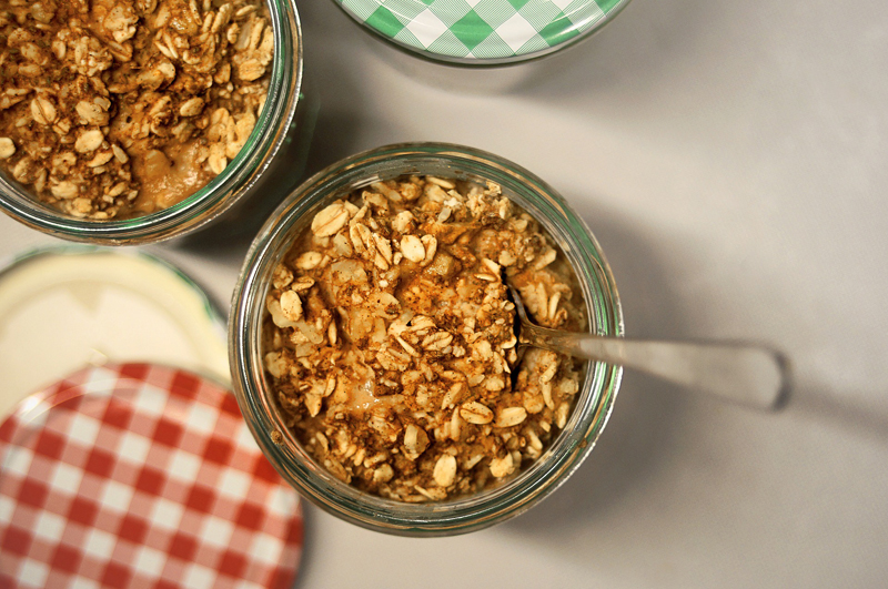
It sounds difficult, but in reality, it’s quite easy. If the item can be picked up with hands, choose photos in which it is positioned correctly, that is, so that you can pick it up.
For example, most people hold a spoon in their right hand while eating. Therefore, place cutlery on the right for easy “interaction” with the right hand.
Let’s look at some examples:

For comparison, an example of an unsuitable visual:

When you take a look at the picture, you feel that the way the cup is positioned is not convenient.
In poker, players use their right hand to look at their cards. Therefore, a visual for a casino may depict a right hand holding the cards:

Mentally, the user is already engaged in the game process, the cards are placed in a way that he is used to.
Remember: Creo, created for the user and prompting him/her to take an action, convert better.
Third method: more emotions
Add emoji to the signature of the push. Smiles multiply users’ emotional engagement with the ad.
Are you in doubt? ![]()
According to the statistics, pushes with emoji get 26% more clicks ![]()
Creating effective creatives is easy. Follow the three key rules:
- place the picture on the left and the text on the right in the visuals;
- position the items on the creo in a way that will trigger users’ desire to pick it up;
- add some emotions to the notification.
Create converting creatives. Blast quality RichAds push traffic.
What is RichAds?
🔝 Push and pop ads,
🔼 CPC starts from $ 0.003,
🔝 CPM from $0,3 in Tier 3, $0,5 in Tier 2, $1 in Tier 1,
⏫ large volumes of available traffic in more than 200 geos.


