Pop-up and popunder ads are the ad formats that demand very little in terms of creatives but can deliver great profits. But what do they actually consist of that makes them so effective?
Here, we gathered the most vivid pop-up and popunder ads examples for leading verticals!
In this article we will show over 20 pop-up and popunder ads landing and pre-landing pages examples for the best verticals.
What is a landing page?
Landing page is a web page that opens in a pop ads tab and presents the offer. On pops it appears after a user clicks anywhere on a publisher’s website with a special script, depending on whether it’s pop-up or popunder ad, above or under the initial browser window.
For pop ads, a landing page is the only creative needed to advertise. Landings preserve everything needed to engage the audience and lead them into performing the targeted action. Usually they appear with a themed visual based on the niche, simple offer description and a strong call to action. Landing page is purposed to convert even the audience that isn’t initially interested in the product into clients, thus it must cover all angles.
Below we listed some advice to follow while composing pop-up or popunder landing pages. Keep them in mind as of some the performance of your promotion will depend!
Tips for landing page creation on pop-up and popunder ads:
- Make sure the page loading speed is optimal.
Since people don’t expect the landing page on pop-up and popunders to appear, no one will wait for it to load. So as soon as it opens, users will have less than a couple seconds to evaluate the offer while leaning to close the new tab.
It’s recommended that the page should weigh no more than optimal 200 Kb and load faster than 1 second. To lighten the weight you can compress images using such services as TinyPNG, Kraken.io or JPEGmini. Loading speed can be increased with locating the server the closest to a potential user, for example, by using fast hosting like TimeWeb, and connecting CDN or VPS. - Check if the page is properly localised.
As landing page is the first place users will learn about the offer, it must seamless to explore. Make sure the page is properly translated into language of the targeted audience and presents all the popular payment methods in the region. - Research your competitors.
In order to keep your pop-up or popunder advertising up-to-date, you might have a peek at what others do via affiliate spy tools. For pop ads you can look, for example, at SpyPop free service, which lists landing pages filtered by regions.
There’s no need to make an exact copy of a landing page you’ve seen, but to know what’s trending right now in the approaches and working for other advertisers.
Pre-landing pages for pop ads
Apart from a landing page, on pops there is also another form of advertising — a pre-landing page. Usually a pre-lander comes before the landing page, and serves as a warm-up for the audience to increase engagement and familiarise with the product. Then, the users get redirected to the landing page with the main offer.
Pre-landing pages might contain interactive elements to engage the audience properly. Depending on the niche, the interactive elements will vary, for example, Gambling offers’ pre-landing pages will offer users a ‘freespin wheel’, and E-Commerce offers will offer a survey on the preferable clothes.

What is RichAds?
Ad network for telegram ads,
high quality push and popunder ads,
domain redirect, native and display traffic source,
buy push ads at $0.005 (CPC), pop ads at $0.5 (CPM),
domain ads costs start from $1.5 (CPM), native ads — from $0.001 (CPC),
ad network offers large volumes of traffic in more than 200 geos from Tier 3 to Tier 1.
20 pop-up and popunder ads examples for top niches
In this part we will break-down the landing pages structure by examples of pop-up and popunder ads for leading verticals according to RichAds ad network’s data.
Pop-up and popunder ads examples will be shown for the offers of:
- Gambling;
- Betting;
- Finance;
- E-Commerce;
- Media
- Software & Utilities.
1. Gambling offers example on pop-up and popunder ads
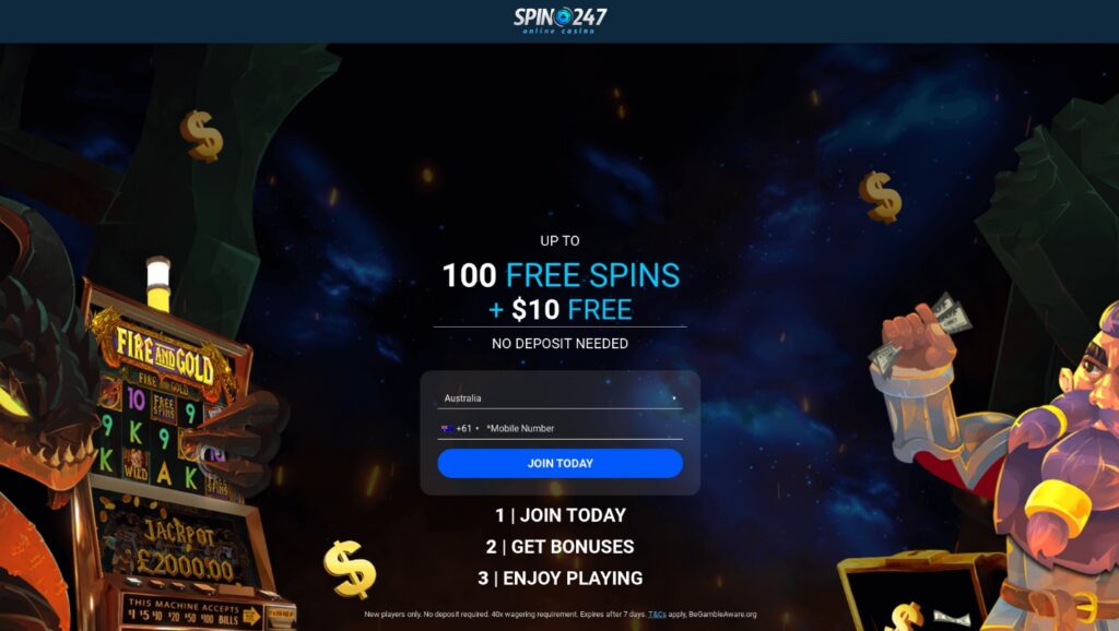
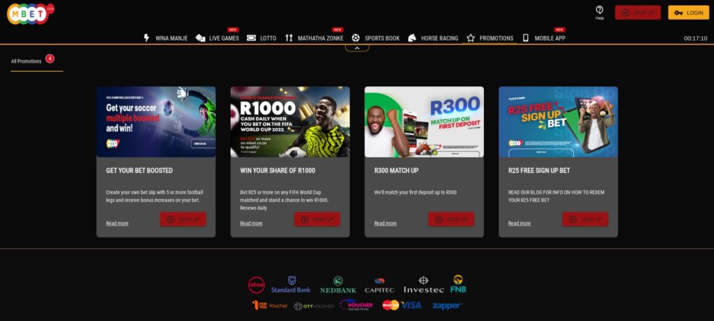
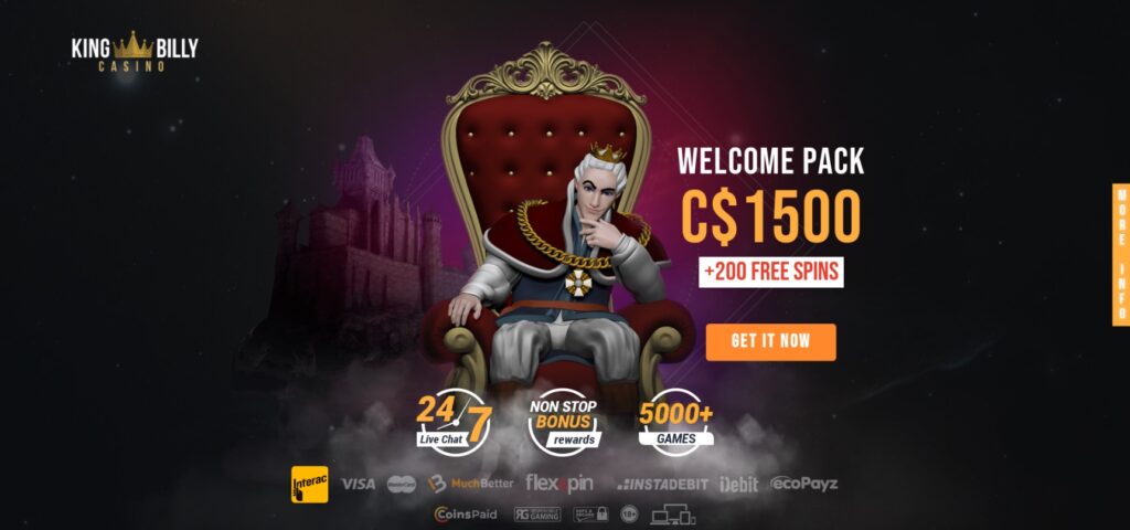
Gambling is one of the top verticals to promote on pop-up and popunder ads, so there are plenty of examples what it should look like. The headline usually highlights main features of the offer, for example, time limited bonuses upon registration which form is placed below. The main call to action button is to “Join”, “Play” or “Create account”.
Main points of Gambling landing pages on pop-up and popunder ads:
- Simple registration form.
There’s no need to overwhelm the audience will many fields to fill while registering as it might scare the users off. Stick to the email or mobile phone to start as following steps will demand more info towards the target action. - Payment methods showcase.
Since of the targeted action for online casino offers is to deposit, it is recommended to present the payment methods on the landing page. Thus, users will see that it’s simple to top-up their balance the way they want.
More pop-up and popunder ads examples for Gambling offers:

2. Betting offers example on pop-up and popunder ads
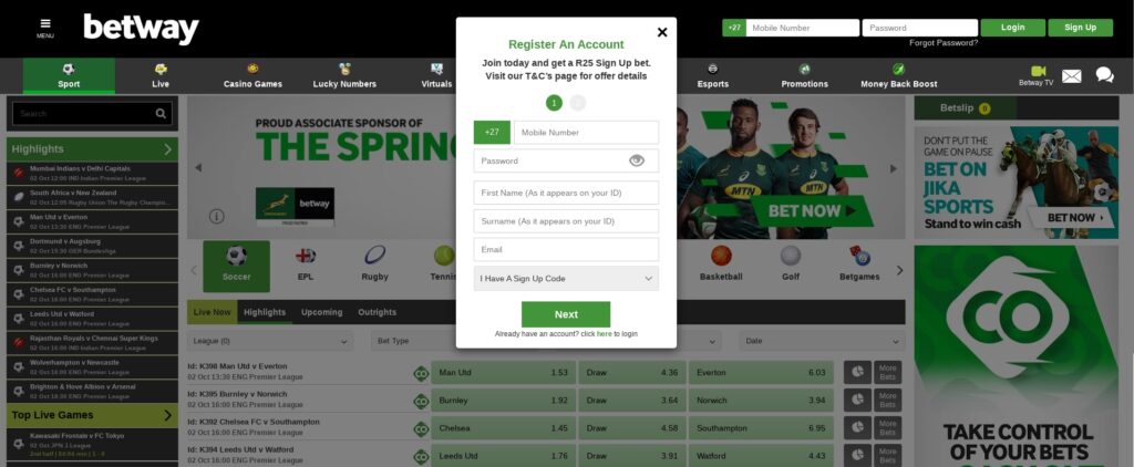
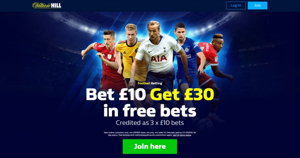
Betting promotion on pop-up and popunder ads is an example of the most straightforward approaches. Such offers’ landing pages usually present the platform that shows bets tables or popular sports events happening at the moment. Users prefer to see the main features of sportsbook right away.
Main points of Betting landing pages on pop-up and popunder ads:
- Up-to-date sports events.
Betting audience shows high activity during big events, so it’s important to highlight big tournament such as Football World Cup on the landing page. - Emphasizing simple withdrawals.
For Betting vertical the opportunity to withdraw funds is of high value for the users. Keep in mind that people place bets usually to earn money, so it’s essential for them to see that they can withdraw them fast and easy.
More pop-up and popunder ads examples for Betting offers:

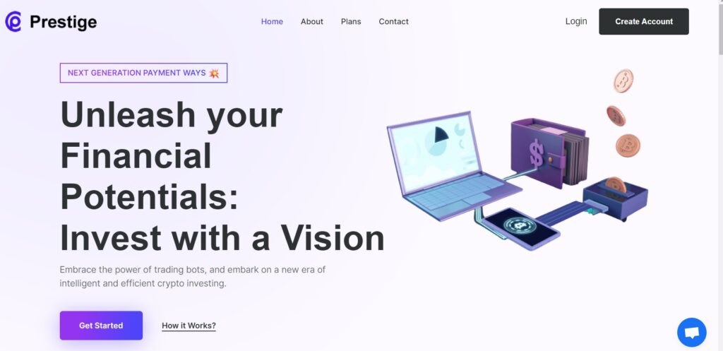
3. Finance offers example on pop-up and popunder ads
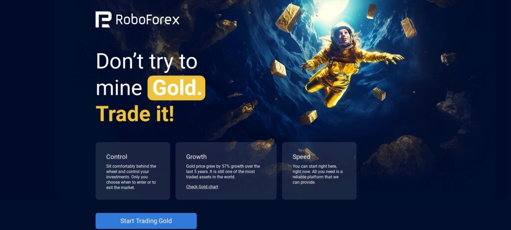
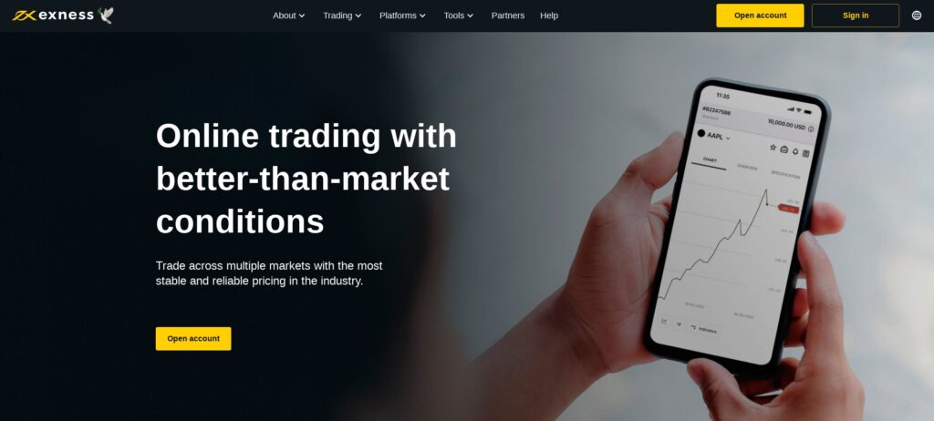
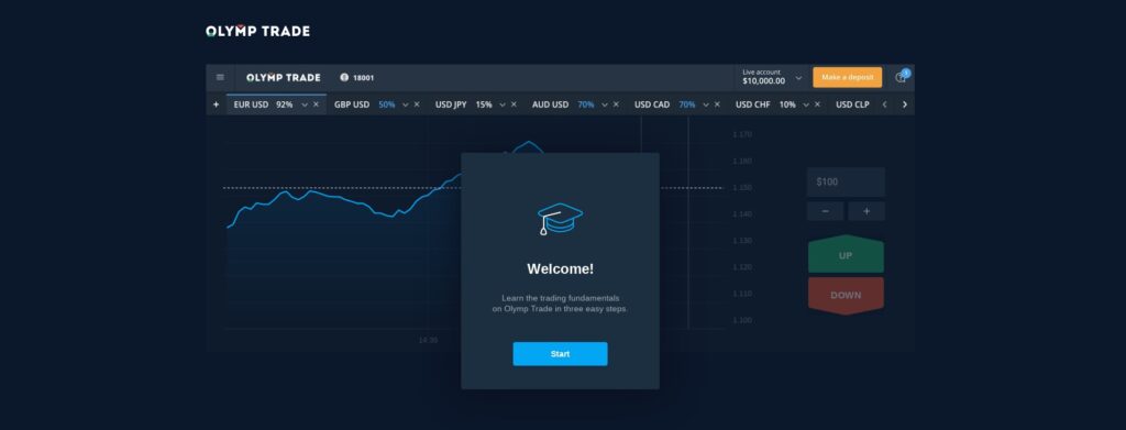
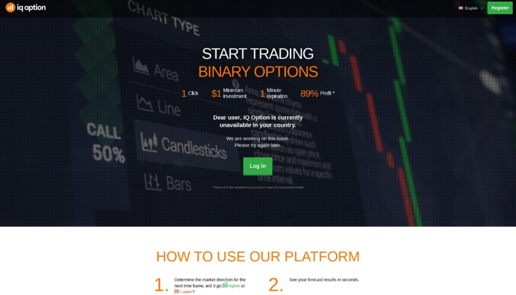
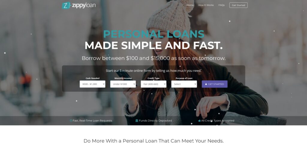
Finance landing pages on pop-up and popunder traffic usually approach the audience softly. Landing page doesn’t reveal the platform straight away, starting only with highlighting main features whether it’s a trading or investing platform. The main point is to demonstrate how easy it is to start earning on the product without losing anything.
Main points of Finance landing pages on pop-up and popunder ads:
- Easy-to-learn showcase.
People might feel afraid joining complicated platforms, so on the landing page you can highlight providing guidance. The simpler it seems to start, the more engaged users will get along the way. - Verified and secure.
Users don’t want to part with their money straight away. So in order for the landing page to work, you might want to add clients’ reviews or other forms of proving the product’s effectiveness.
More pop-up and popunder ads examples for Finance offers:
4. E-Commerce offers example on pop-up and popunder ads
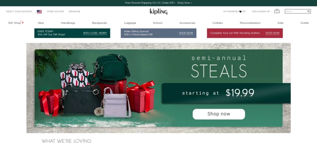
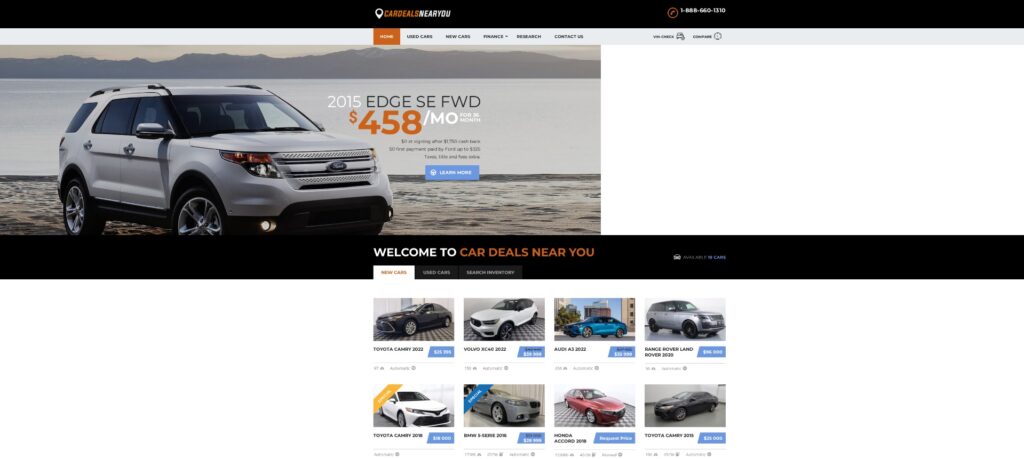
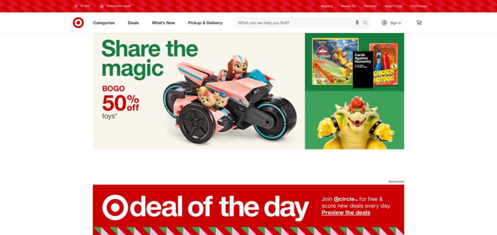
E-Commerce offers on pop-up and popunder ads usually present the main page of the online shop. The landing page might showcase seasonal products, goods for sale and gifts for big purchases. The main point is to demonstrate the rich catalogue and that anything can be get as easy as in a physical shop.
Main points of E-Commerce landing pages on pop-up and popunder ads:
- Benefit of the deals.
In order to push users towards performing the targeted action you might highlight how beneficial the purchase really is on the landing page. Listing seasonal discounts or time-limited sales on the main page is highly effective. - Seamless shipping.
Any user expects their goods to be delivered in time and without problems while ordering online. This can be highlighted right in headline of the landing page to ensure users see all the advantages.
More pop-up and popunder ads examples for E-Commerce offers:
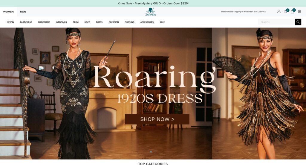
Check out E-Commerce case stydy on pop ads to see the real results effective landing pages can deliver.
What is RichAds?
Ad network for telegram ads,
high quality push and popunder ads,
domain redirect, native and display traffic source,
buy push ads at $0.005 (CPC), pop ads at $0.5 (CPM),
domain ads costs start from $1.5 (CPM), native ads — from $0.001 (CPC),
ad network offers large volumes of traffic in more than 200 geos from Tier 3 to Tier 1.
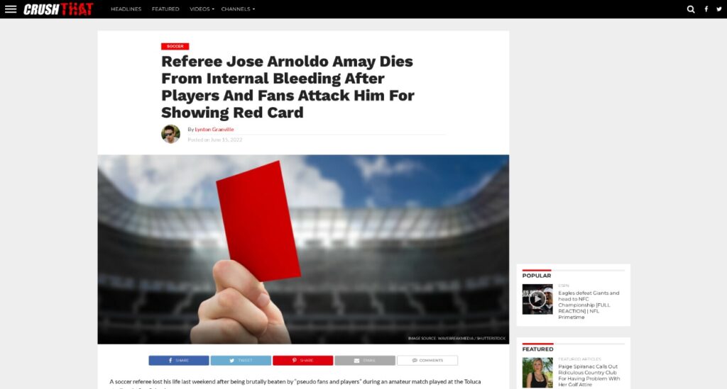
5. Media offers example on pop-up and popunder ads
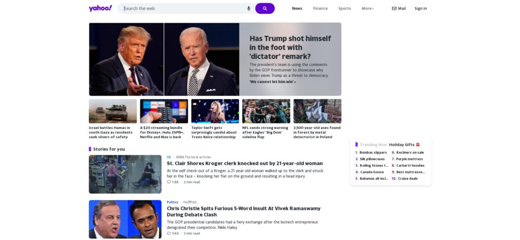
Media vertical is so-called an ‘umbrella niche’ that actually might include many different offers from personal blogs to YouTube channels. Landing pages for Media offers usually show the advertising resource straight away, highlighting methods to subscribe to it and get updates on the new content.
Main points of Media landing pages on pop-up and popunder ads:
- New content updates notifications.
Highlight that users can keep in touch with the resource and new updates, such as subscribing to the mailing or bookmarking.
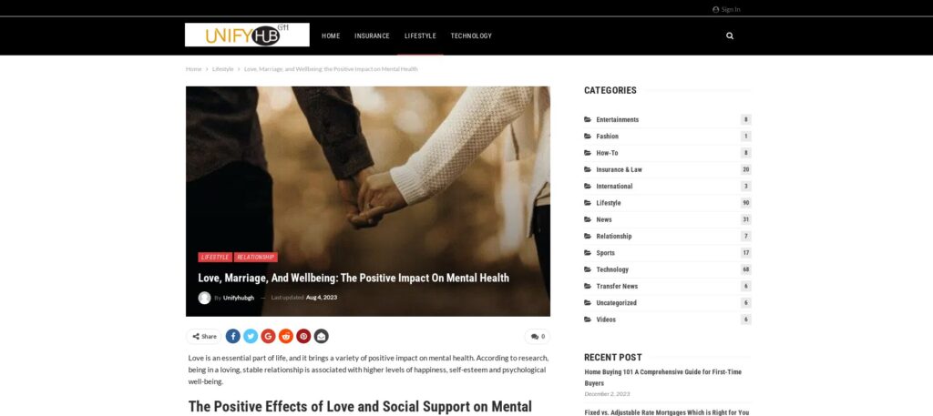
More pop-up and popunder ads examples for Media offers:
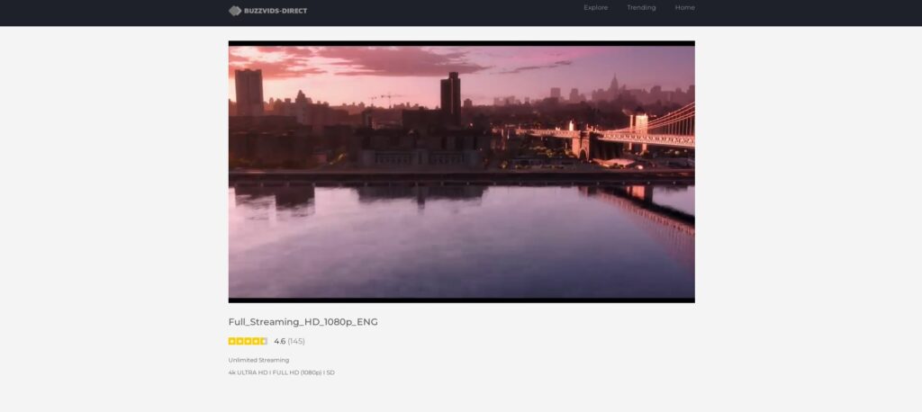
6. Software & utilities offers example on pop-up and popunder ads
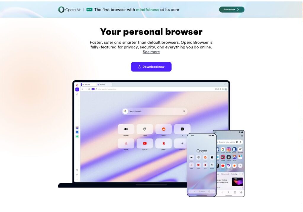
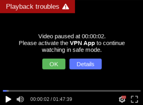
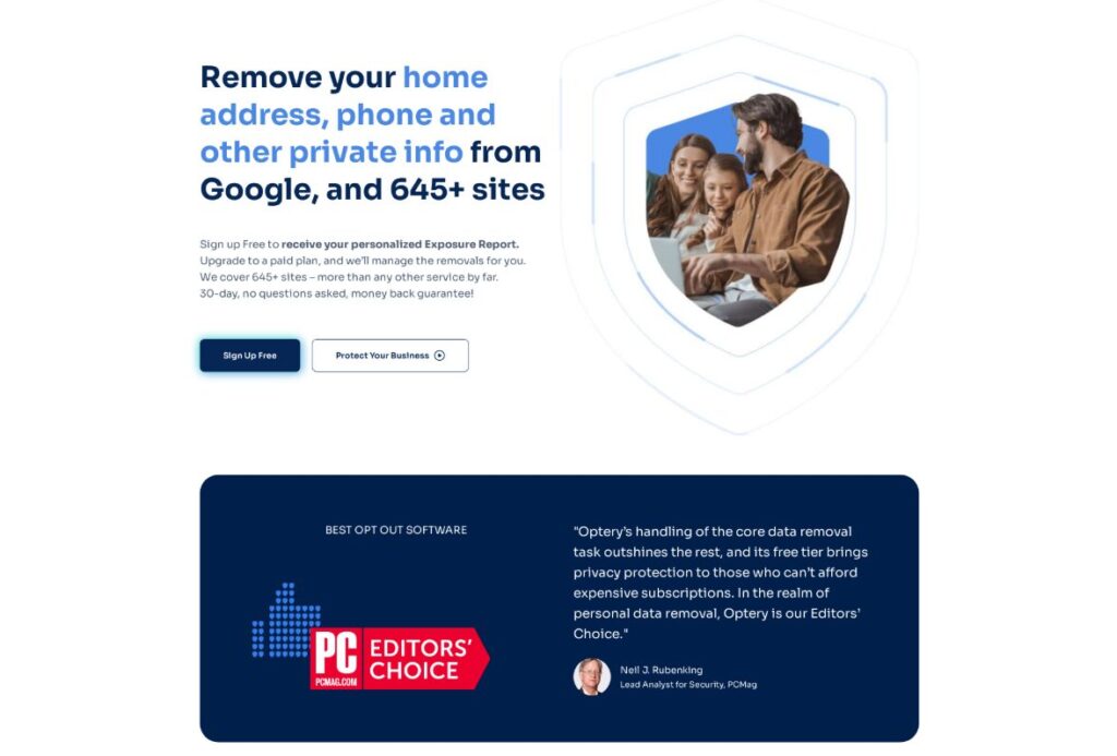
Software & Utilities vertical focuses on problem-solving. It’s a practical niche that includes tools like antivirus software, VPNs, system cleaners, browser extensions, download managers, and other everyday utilities. Landing pages for Software & Utilities usually present the solution immediately, clearly explaining what problem the software solves and how fast it can be installed.
Main points of Software & Utilities landing pages on pop-up and popunder ads:
- Focus on safety and privacy.
Emphasize protection from viruses, data leaks, tracking, or online threats, using clear trust signals and simple explanations. - Simple and fast installation.
Highlight one-click or quick install processes, minimal setup, and instant results so users know they can start using the software right away without technical hassle.
More pop-up and popunder ads examples for Software & Utilities offers:
Conclusion
Now you know what effective pop-up and popunder ads might look like by the examples in this article. We showed the most popular approaches used to compose landing pages for the verticals, but you might add some details from one to another. The only things that matter are keeping it simple, optimizing the page so it loads fast and properly describing the products.
We at RichAds have been working with pop-up and popunder traffic for many years, and are dedicated t make our platform the best to run these formats. You can launch an ad campaign on pops traffic right now on over 220 geos from Tier 3 to Tier 1! Start earning on pop ads with RichAds!
What is RichAds?
Ad network for telegram ads,
high quality push and popunder ads,
domain redirect, native and display traffic source,
buy push ads at $0.005 (CPC), pop ads at $0.5 (CPM),
domain ads costs start from $1.5 (CPM), native ads — from $0.001 (CPC),
ad network offers large volumes of traffic in more than 200 geos from Tier 3 to Tier 1.
Frequently Asked Questions about Pop-up and Popunder Ads Examples
- What makes a pop-up or popunder ad effective?
An effective pop-up or popunder ad grabs immediate attention with a clear and compelling value proposition, strong visual elements, and a direct call to action. High-performing ads match user intent, use urgency effect (timers or limited offers), and lead users to a relevant landing page that continues the message. Reliable ad networks, like RichAds, also help increase pop ads efficiency by offering precise targeting and advanced optimization tools. - Which pop-up and popunder ad examples convert best?
The best converting pop ads include bold visuals matching the offer category and localized messaging tailored to the target GEO. To boost engagement and encourage users to click, you can also mention bonuses or rewards (e.g., “Free Spins,” “Exclusive Deposit Match”) and short, curiosity-driven headlines that spark interest or a sense of missing out. - How to optimize pop-up and popunder ads for better results?
To improve performance of pop-up and popunder ads localize your ads and align ad copy and visuals with the landing page message so users see consistent value and benefit from click to conversion. Always test multiple creatives and headlines simultaneously to see what resonates best with your audience. You can experiment with timing, triggers, visuals, and CTAs. Check what optimization tools are provided by your advertising network and use them smartly. Popular ad platforms, like RichAds, provide clear performance data so you can whitelist high-converting sources and blacklist underperformers, reducing bounce and optimizing budget allocation.


