


Push notification advertisements would seem to be the first format that looks different on every device, OS, and browser.
If you’re not familiar with push advertising, read about it.
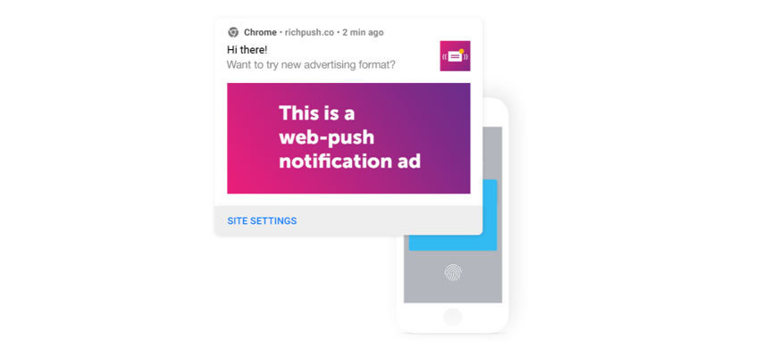
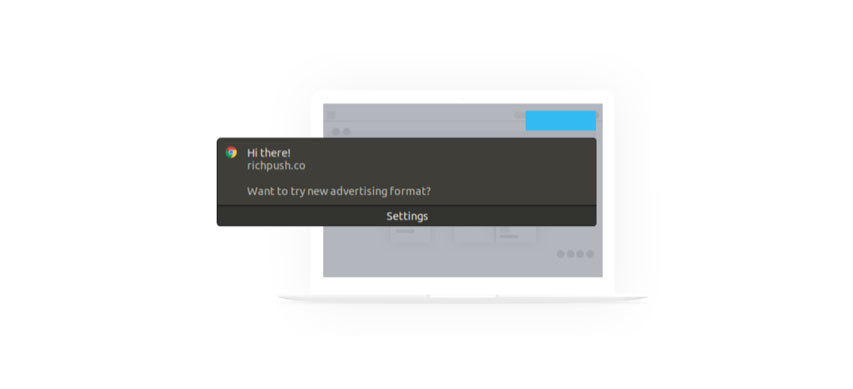
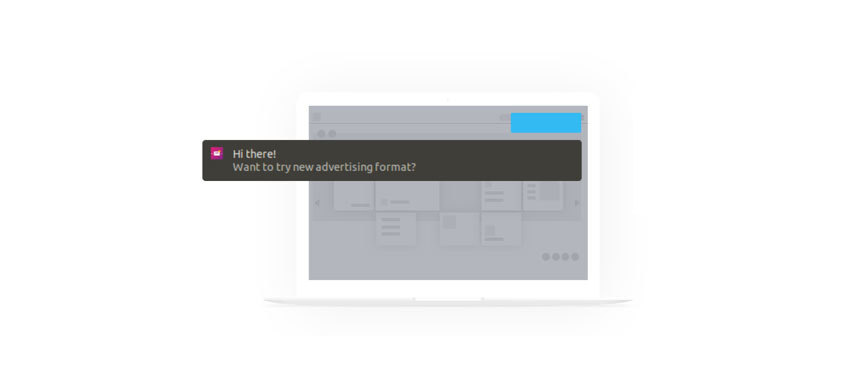
Any push network will tell you that their push notifications look like this:
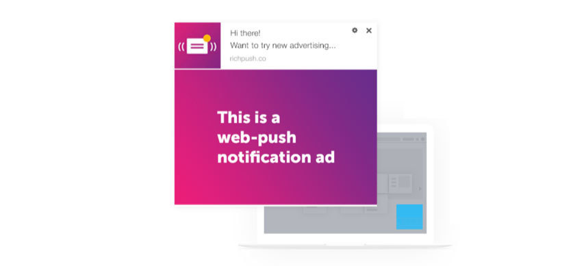
192×192 logo, 492×328 banner, 30-character title, and 45-character description.
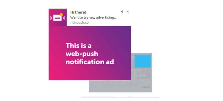
The Rich Ads format really does look like this, but only on Windows 7-10 Pro in the Chrome browser. In the same version of Chrome, but on Windows 10 Home, it might look like this:
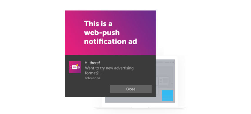
The layout is completely different, and the push ads banner has been reduced to 492×245. A weird ellipsis has appeared, even though the full description is shown.
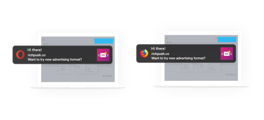
Windows 7, 8, 10 Home, and 10 Pro, but Opera:
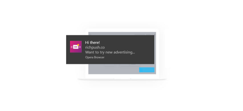
No banner at all, and the description and title can be trimmed to 27 characters.
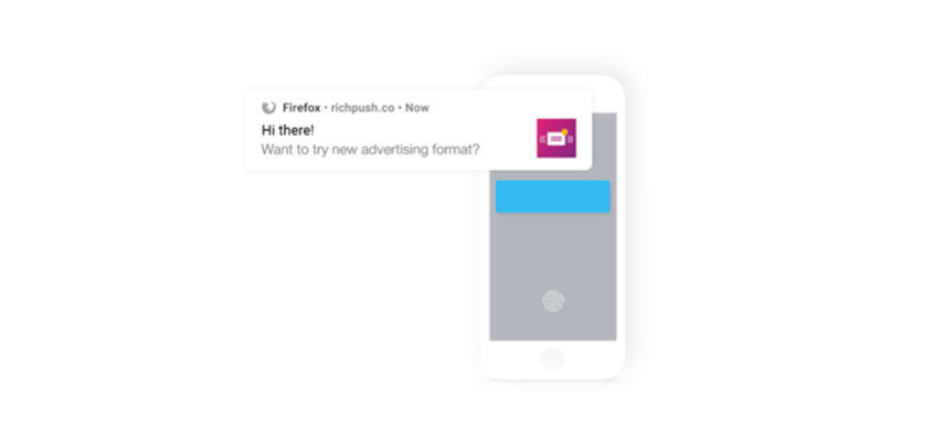
This is what life didn’t prepare us for. Push ad on Windows 7, 8, 10 Home, and 10 Pro in Firefox:
There is no banner, the title has gone to the top-left corner and is now almost unnoticeable, and there is a lot of empty space and some weird layout.
What surprises are in store for us in Chrome on Android?
Everything is OK, except the banner is 492×225, and not 492×328.
As might be expected, the banner was not sent to Firefox on Android:
Everything is OK, except the push ads banner is 492×225, and not 492×328.
And here’s what you get on macOS:
No big banner, in the browser that sent the notification the icon has been pushed off to the right. The push itself has moved from the bottom-right corner to the upper-right.
Chrome on macOS is a little different: it adds a couple of buttons and shortens the text to 27 characters to accommodate them: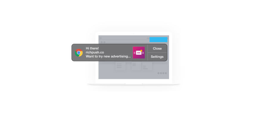 Push notification on macOS
Chrome on Linux chose to send neither the logo nor the icon. Just because it can:
Firefox made the push even smaller, but left a ridiculously sized logo:
Let’s end on an optimistic note. In Opera on Linux, the push looks almost normal:
The text has been cut to 27 characters, but this is okay for a Rich Push banner.
We hope this mini-guide will make it easier for you to optimize your campaigns and increase your conversions. In the meantime, we’ll keep testing different browsers and devices. If we find out anything interesting, we’ll let you know!
What is RichAds?
🔝 Push and pop ads,
🔼 CPC starts from $ 0.003,
🔝 CPM from $0,3 in Tier 3, $0,5 in Tier 2, $1 in Tier 1,
⏫ large volumes of available traffic in more than 200 geos.
Pack of 300 best icons for push notifications. Download for free.