If you have a question about how to make ad banners, you are definitely engaged in ads promotion. And most likely, you do not have a designer who will make the banners for you.
We have collected the main advertising trends in 2021 and valuable services for beginners to create an effective banner.
At the end of the article, you will find a new visible advertising format.
Essential online advertising trends in 2021
The widespread isolation in 2020 has forced people to seek entertainment on the Internet. No wonder that the total time that users spent online increased.
No need to say that the active use of digital technologies will only increase in 2021.
To create a clickable ad banner, you need to figure out which ad format is more in demand. We will begin to discuss trends with ad formats and then move on to the design of banners themselves.
In short, the world is ruled by video formats, and a potential buyer often holds a smartphone in their hands and interacts with advertising mainly through it.
Trend # 1. Mobile advertising rules the market
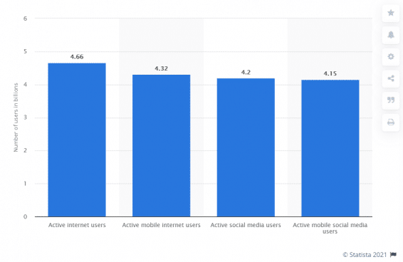
In January 2021, there were 4.66 billion active Internet users, 4.32 billion of which are using mobile devices.
What does it mean for you? Choose mobile ad formats, run ad campaigns in mobile applications, be active in instant messengers (chatbots and channels, for example).
When the banner is ready, check how it looks on the mobile version of the site and how fast it loads. There is no point in making a super-trendy animated banner if it takes more than 10 seconds to load.
Trend # 2. Videos, more videos
Video formats are confidently beating the good old static banners. We are not talking about expensive commercials. You can shoot the video yourself. Simple and successful video ads on Instagram only confirm this.
Make your video as vivid as possible. People love stories. So tell them a story in which they will recognize themselves or want to be the main character!
Remember that the user is ready to give you no more than 5-10 seconds of their time. If the interest does not appear immediately, they will not watch the advertisement.
If we talk about videos, we cannot fail to mention webinars, video reviews, and even videos for articles (for example, videos with expert opinion). They are also in trend.
Trend # 3. Advertising in Stories and Reels
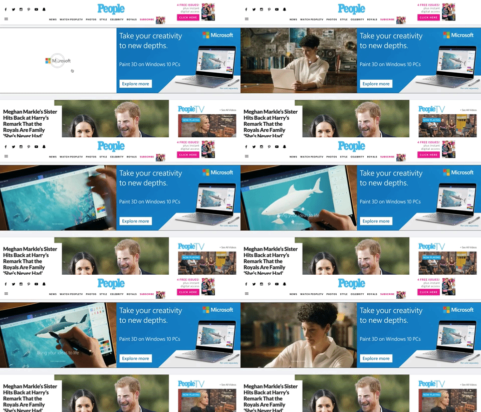
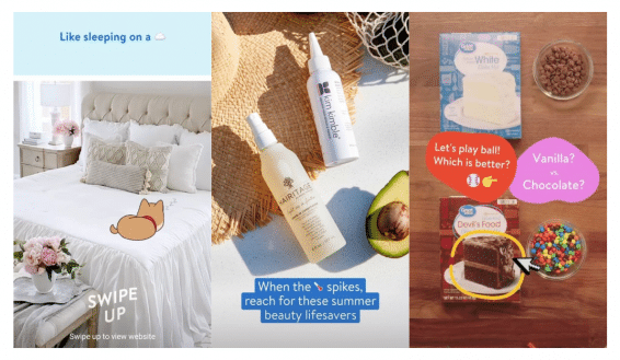
Pay attention to the format of Instagram Stories and short videos on Tik-Tok. No wonder Facebook and Youtube have added Stories to their interface. It’s time to start using them not to miss the chance if you haven’t tried them yet.
Simple photos and videos shot on the usual smartphone can bring you new clients. The main thing is to use a modern design, dynamic editing, and suitable music.
It is not a big deal if you’ll use the ready-made layouts from the list of services attached below.
Don’t forget about reviews. On Instagram, you can repost a product’s review, attach a link to it, and voila. In this case, the review may look very simple.
Trend # 4. Power of influencers and micro-influencers
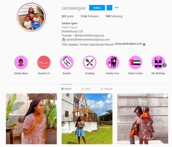
Previously, people trusted word of mouth. Now they listen to top bloggers and micro-influencers (people with a relatively small number of subscribers).
A curious trend has emerged recently: people are more willing to respond to ads from people with a small audience. Perhaps it’s the very word of mouth effect.
It’s easier to believe a friend from Instagram whose life you watch from day to day, especially if it is shown in a personal experience format. An advertisement on a website won’t have such a “warm” audience.
Trend # 5. Make it easier to understand the ad
Hurray, you nearly made it! Here are some tips to create the perfect banner.
In 2021, simplicity, conciseness, and white space became the main rules for creating converting banners.
Saying white space, we mean a place on an ad banner that is not filled with text or pictures. Such ads attract the user’s attention. It’s no surprise that the user is fed up with advertising where there is not a single free centimeter.
Simplicity doesn’t mean boredom. More often, it is about using 1 or 2 colors and one central object.
When it comes to ad copy, make it short and simple. The time of wordy ads has gone into oblivion.
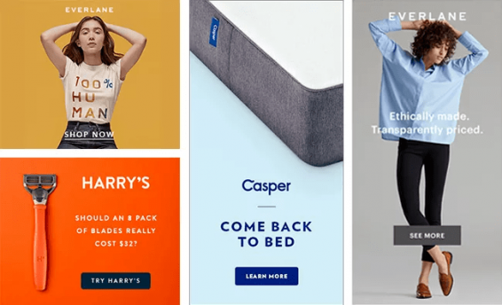
How to make ad banners
To make an effective banner, you need to go through 5 main steps. The success of your advertising campaign largely depends on them. At the same time, the step of creating a banner itself is almost in the last place.
5 tips for ad banner creating
- Reveal the purpose of the advertising campaign
Your banner will look different depending on the goal (to get conversions, increase brand awareness, talk about updates or discounts).
Its text and the presence or absence of CTA (call to action) buttons will depend on the final goal.
- Describe a portrait of a potential audience
- Who are the people who buy your product or service?
- What problems are you helping to solve?
- Which argument from the list will make them click on the banner?
- What objections do buyers have most often?
The answers to these questions are essential to understanding your audience. If you correctly identify the right audience and understand its need, this will significantly increase the chance for success.
- Write multiple ad copy variations
Based on the two previous points, you need to write the most simple text, at the end of which there will be an explicit call to action (if you count on it).
For example, “register now,” “leave your email, and we’ll send a catalog,” “free consultation.”
If you want to show the benefits, do not write “discounts up to 70%”. Show the old and new prices instead. So it will immediately become apparent what benefits a client will receive.
Why do you need multiple ad copies? No matter how well you know the audience, you can’t know exactly what will attract a customer without a single test. The best option is to write several variations of the text and test them all.
- Choose images for the banner and decide on the color scheme
Most likely, you have some ideas for the banner. But if not, you can get them from Pinterest. Also, Pinterest is full of banner ad design tips, including ad layouts.
You can spy on competitors using special services. For example, in the Ad Library, you can see what competitors are launching on Facebook ads.
Colors are also crucial for ad banners. Some colors convey a sense of urgency, while others muffle anxiety and excitement. You can read more about the effect of color on buyers here.
- A / B test different banners
A / B test (aka split test) is an experiment during which the users see different variants of ad banners. Then you estimate banners’ performance by the user’s reaction.
The test will help you understand which banner is the best and not waste your budget on showing less successful options.
A successful advertising campaign is impossible without tests. Don’t skip this important point. Even if your hypothesis about creatives were reasonable, users might not understand the idea.

Where can I get free images for ad banners?
Let’s start our ad banner design guide with the main question: can I get free images that don’t break out of copyright law?
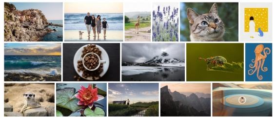
The most affordable way to make an effective banner is to find ready-made photos on photo stock — no need to organize and pay a photographer.
Photo stocks can be free or paid. We are, of course, interested in free options. And in the case of stocks, “free” does not mean that there is no choice at all.
Here are 5 photo stocks where you can look for suitable pictures:
- Pixabay — 1.9 million images + music and video;
- FreeStockImages — over 100,000 free photos;
- Picjumbo — over 20 categories with free photos;
- All The Free Stock — a source of photos, icons, sounds, and videos;
- Stock Up — 25,000+ free stock photos.
If you don’t find anything in free stocks and are ready to pay, then Shutterstock is the largest photo bank. It contains 300+ million photos, illustrations, examples of vector graphics, videos, and music. You can also download 10 free images during the 1-month trial period.
What tools to use to design a banner ad
So we come to the most challenging stage: the creation of the banner itself.
Fortunately, some services make this step easier for anybody who doesn’t own Photoshop or Figma. We’ve prepared the list of services that will help newbies and experienced marketers make ad banners.
Some of them have ready-made templates for platforms like Instagram or Facebook.
5 best tools to create clickable ad banners
1. Canva
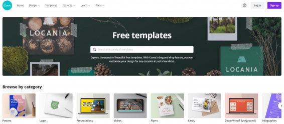
Canva is a one-stop service for creating promotional materials. Most of them are available free of charge.
There are collected ready-made templates for ad banners on Instagram, Facebook, Youtube, Whatsapp, and patterns for presentations, posters, and documents. Their templates already include banner ad design tips.
The creators have not forgotten about the video format. You can also work with video ready-made templates on the platform.
An indisputable plus of the tool is that anyone can master it without any experience in design.
2. Colorcinch
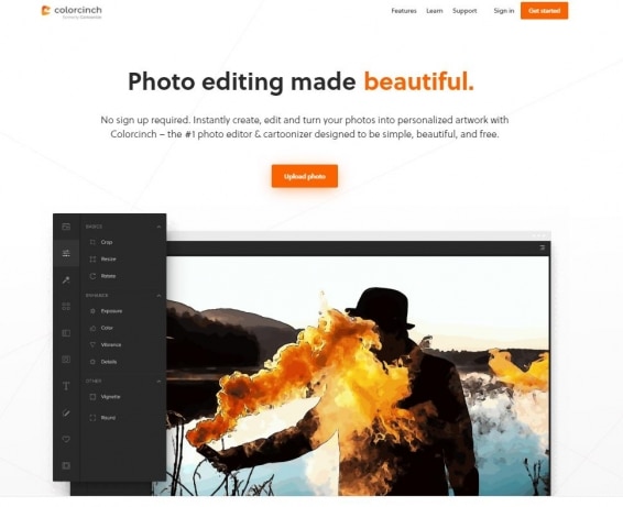
Colorcinch helps to edit photos online.
What can the service do? Crop, make photos brighter or more contrasting, and superimpose pictures on top of each other. Various filters, including animated ones, are also available. You can add ad copies or one of the accessible icons to the photo.
A free photobank with images has been added to the service. Some of the functionality can be used free of charge.
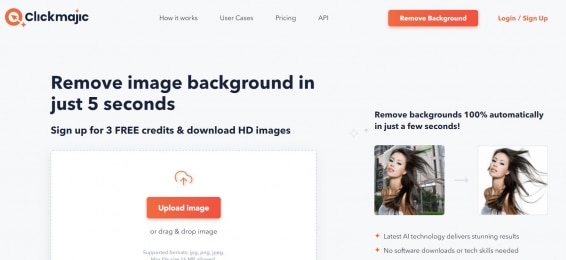
3. Clickmajic
Clickmajic is a tool that helps to remove backgrounds in photos.
If something from the background prevents you from creating a beautiful banner – delete it in a couple of clicks.
Clickmajic is an excellent opportunity to highlight one main character/object if there are several of them in the photo.
The tool works with photos of any complexity, even if there is flowing hair or an uneven background. The service will cope with its task in a few seconds.
Cons: only 3 pictures are available for free, and you have to register.
4. Infogram
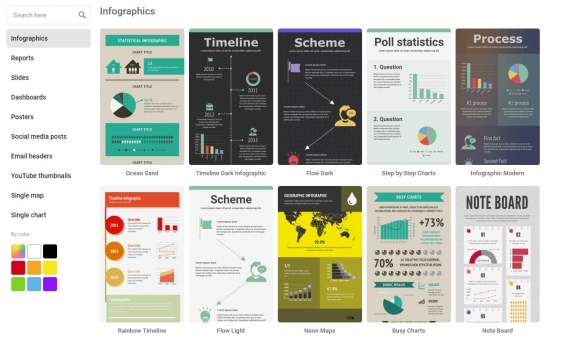
Infogram is a service that helps to create infographics — understandable posters with text, graphs, and pictures.
Infographics are an essential thing for an internet marketer. It can be placed on a banner or used on a landing page. Such content builds user confidence.
In the free version, you get access to 37 types of infographics and 13 types of maps. In addition, the service can animate objects and create posts and stories for social networks.
5. TinyPNG
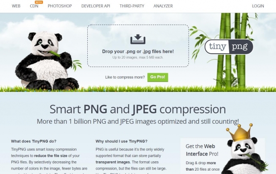
TinyPNG is a service that helps reduce the weight of your ad banners. It works with two formats PNG and Jpeg. The tool can also compress animated PNGs.
The TinyPNG tool copes with the task as quickly as possible and works for free.
It is useful if you want to reduce your page load speed. If you run ads through ad networks with paid traffic, the service comes in handy to adjust the banner weight to the desired value.
Push notifications are a cure for banner blindness
The main problem that plagues many marketers is banner blindness. The ad banner can be cool and trendy, but users bypass them on the page.
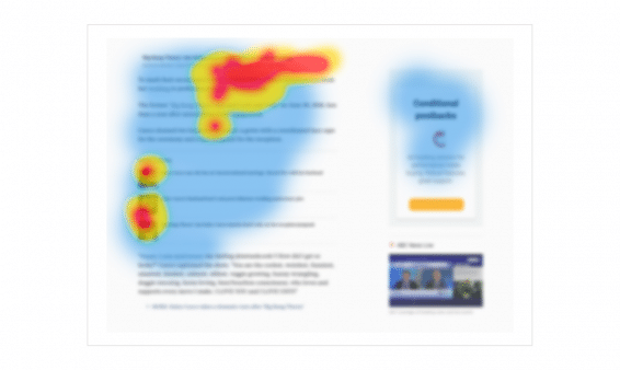
Of course, you can make the creatives brighter and more noticeable, but this does not always help.
A new ad format might help. Especially if its visibility is up to 100%, and these are not empty promises.
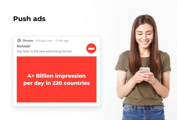
A push notification is really hard to miss. It looks similar to notifications from the messenger and appears on the same part of the screen. The user has no choice to ignore them.
Users’ eyes check the notification to understand what they got. And then it’s up to you if the push ad will interest them.
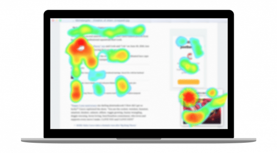
How to create a converting push banner
Push notifications are noticeable but not very large. It is essential to know some main points about its design to make a profit on them. The main one is to create the notification that will immediately tell what the advertising offer is.
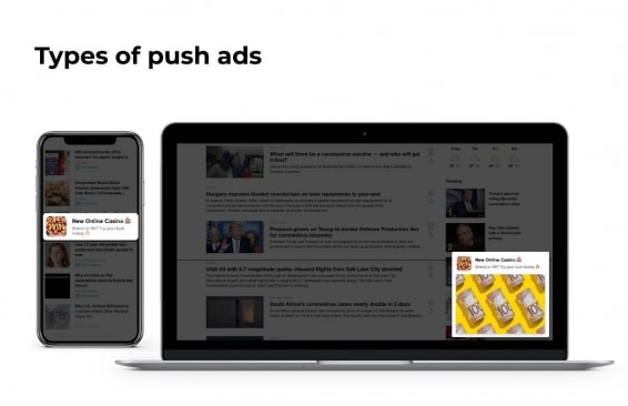
An icon is the first thing that the user notices. And this is the only picture that the user sees on mobile. Ideally, if the icon consists of one large object and tells the users what the advertisement is about.
Here are collected over 300 best icons in 8 top verticals. Download them for free.
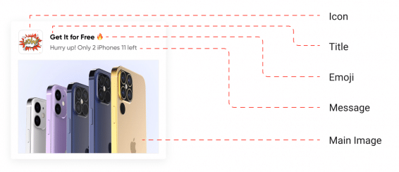
A main image appears only on the computer’s screen. It can accommodate one large or two small objects. Pictures with a lot of small details are not good for getting conversions.
The push text is limited to 75 characters: the maximum title length is 30 characters, and the description is 45 characters.
Add a short text to the main picture.
Make the additional text large enough to be easy to read. Use no more than 5 words.
Try to summarize your offer concisely and clearly.
The personal notification format allows you to address a potential buyer using the pronoun you, and this will be appropriate.
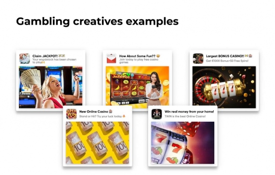
If you want to increase conversion — add emoji to the text! They draw attention to push notifications and increase conversions up to + 10%.
One of the advantages of push advertising is the ability to personalize it using macros. You can add the city name, phone model, or other things known about the user to the push text. This trick will help you create a well-converting banner.
Don’t want to deal with creatives yourself? Write to RichAds managers, and they will prepare creatives for your push notifications for free.
What is RichAds?
✅ Push and pop ads,
✅ loyal and fast moderation,
✅ help of a personal manager,
✅ CPC from $ 0.003, CPM from $ 0.3
✅ large volumes of available traffic in more than 200 geos.


