


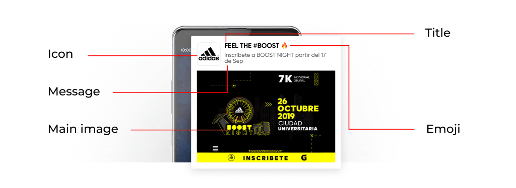
Initially, push advertising notifications with their both attractive and simple look provide very engaging representation of the product in a glance, while the logos play a big part in that. But how to choose the push notification icon that will definitely perform as purposed?
In this article, RichAds ad network‘s team will tell everything about the push notification icons and how to select them correctly.
Push notification icons purpose, parameters and size
The main task of the icon is to hint to the users about what awaits them after clicking on the notification. This is not a decorative element but a tool for hints, explanations, and attracting attention. For push notifications you shouldn’t use too small or too large sized icons and symbols. The size of downloadable push notification icons in RichAds ad network is 192 × 192. It is important that the image be consistent with the content policy of the network:
- you cannot use explicit and aggressive images;
- the icon must match the offer;
- brand names and logos may not be used.
While choosing an icon for push notifications, we recommend:
- Taking into account how the icon will look on different operating systems and browsers;
- Using intuitive symbols for icons;
- Highlighting the point of the offer via the icon.
What is RichAds?
Ad network for telegram ads,
high quality push and popunder ads,
domain redirect, native and display traffic source,
buy push ads at $0.005 (CPC), pop ads at $0.5 (CPM),
domain ads costs start from $1.5 (CPM), native ads — from $0.001 (CPC),
ad network offers large volumes of traffic in more than 200 geos from Tier 3 to Tier 1.
The difference between mobile and desktop push notification icons
When choosing push notification icons, take into account which devices they will be used on, as the size and logo purpose might vary depending on that. In this part you find the main peculiarities of the icons according to a device, based on RichAds advertising network‘s experience with push traffic!
Peculiarities of desktop push notification icons
If push ads are sent to desktops, pay more attention to the attractiveness of the visual.
When receiving ads push notification, the user sees a large interesting image, so on the desktop, it is the visual that attracts attention to the ad, while the icons play a minor role. The correctly highlighted items might sufficiently impact the conversion rate while advertising with push!
Peculiarities of mobile push notification icons
If the push notifications are sent to mobile devices, pay special attention to the attractiveness of the icon. The first thing the user sees on the smartphone is a bright icon, then a title and a description.
It is important that all elements of the notification complement one another:
- the icon should hint and attract attention;
- the title should sell;
- the description should clarify the essence of the offer.
How to choose an logo for a push notification
For push notifications on mobile devices, you might choose the logos that in color and content are similar to the icons of:
- social networks;
- messengers;
- brands that operate in the areas similar to that of the offer.
The icon can visually resemble famous logos and symbols. It can remind of them but not copy them.
For the desktop, select icons to complement the main visual, give another hint about what awaits the user after clicking on the push notification.
Color and coordination
In marketing, color is used to attract potential customers and evoke certain emotions in the target audience. Color may interest, alert, increase confidence, and attract attention. We have already explained how the color of visual affects the CTR of the push notification. The same rules apply to icons — if the icon is to attract attention or make the ad credible, use an appropriate color for it.
Do not forget about the color and semantic coordination between the icon and:
- the title;
- the description;
- the main push image.
What is RichAds?
Ad network for telegram ads,
high quality push and popunder ads,
domain redirect, native and display traffic source,
buy push ads at $0.005 (CPC), pop ads at $0.5 (CPM),
domain ads costs start from $1.5 (CPM), native ads — from $0.001 (CPC),
ad network offers large volumes of traffic in more than 200 geos from Tier 3 to Tier 1.
Examples of push notification icons
Here, you will find some examples of push notification icons, used to compile creatives for mobile and desktop advertising campaigns, gathered for you by RichAds ad network!
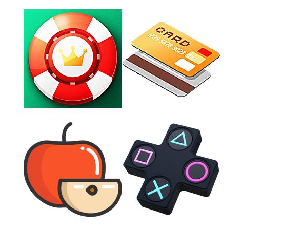
Push notification icons examples for mobile devices
For mobile devices, the push notifications symbols might resemble the famous and easily recognisable services, upgraded with colour and brightness. It’s important that they are visually comprehensive and will tell the user the nature of the offer straight away.
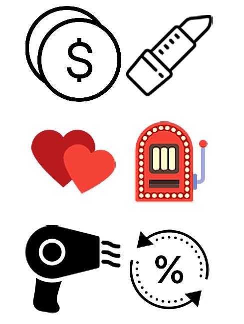
Push notification icons examples for desktop devices
For desktop, both colourful and monochrome (black and white) icons will work for push notifications, as the visual remains a more important part of the push notification. The icons might not resemble a popular brand symbol, but just a gist of what the offer represents, some kind of a common association.
Where to download push notification icons
Almost any resource that shares pictures of symbols and logos can be used for getting icons and compiling your creative for push advertising. Below you will find top websites to download icons for push notifications, listed for you by RichAds push ads network!
- Icon8;
- Fribly;
- Flaticon;
- Smashingmagazine;
- Nounproject;
- Pixeden;
- Iconfinder;
- Mricons;
- Icon-icons;
- Graphicsfuel.
You can also take a look at a pack of 300 push notifications icons that are shared FOR FREE by RichAds!
Conclusion
In the essence, push notification icons are just a small sized “helping hand” to the user, as they give a hint on the offer and aim to play a very intuitive part for approaching the audience. Nonetheless, the icons are not a decorative element, so they are not to be neglected neither for desktop or mobile oriented campaigns. Taking in regard the size, used symbols and offer specifics while compiling an icon will help to make a more attractive engagement strategy and impact the CR from push notifications ads!
We at RichAds have been working with push traffic since 2018, not spending a year without gathering as much experience on advertising peculiarities and specifics of this format. Now, you can launch ad campaigns on over 220 geos from Tier 3 to Tier 1, and have as many in-built and exclusive tools for promotion as possible. Start earning from advertising on push ads with RichAds!
What is RichAds?
Ad network for telegram ads,
high quality push and popunder ads,
domain redirect, native and display traffic source,
buy push ads at $0.005 (CPC), pop ads at $0.5 (CPM),
domain ads costs start from $1.5 (CPM), native ads — from $0.001 (CPC),
ad network offers large volumes of traffic in more than 200 geos from Tier 3 to Tier 1.